Visualize Batch Correction Effects
Source:R/visualization_batch_correction.R
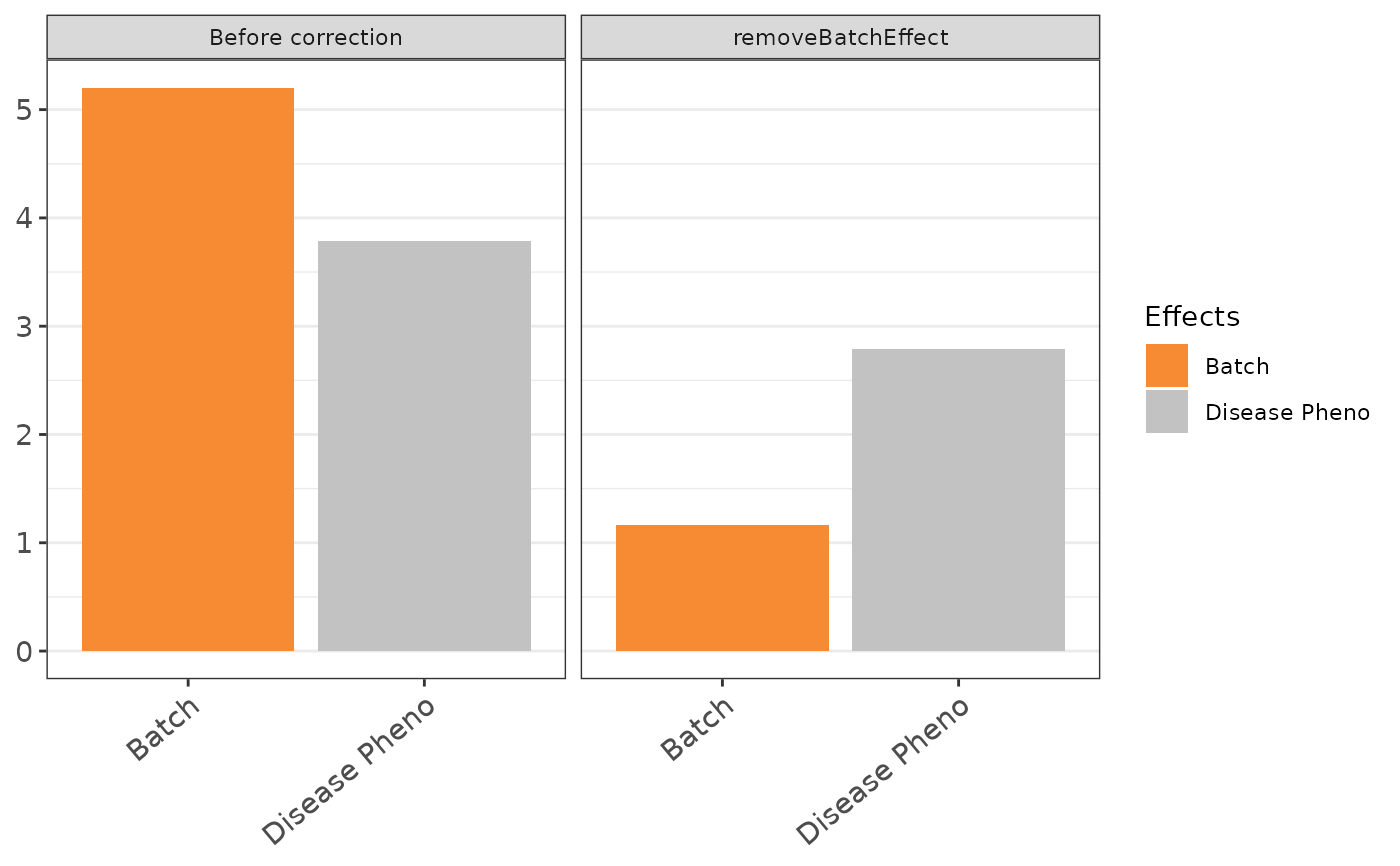
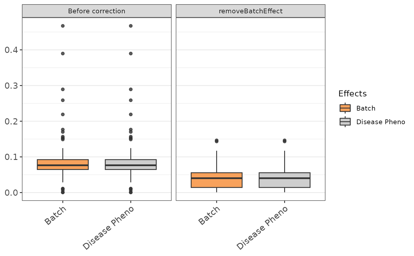
visualize_batch_correction.RdThis function visualizes the effects of batch correction methods by generating boxplot or barplot.
Arguments
- corrected_list
A list containing corrected data matrices.
- categories
Classification of samples
- visualization_type
A character string specifying the type of visualization. It can be either "boxplot" or "barplot".
Examples
#load correct.list from dataPreparation
corrected_list <- dataPreparation::corrected_list
n <- nrow(corrected_list$`Before correction`)
categories <- dataPreparation::imputed_data$categories[1:n,]

# Visualize batch correction effects using boxplot
visualize_batch_correction(corrected_list, categories,
        visualization_type = "boxplot")
#> Warning: replacing previous import ‘S4Arrays::makeNindexFromArrayViewport’ by ‘DelayedArray::makeNindexFromArrayViewport’ when loading ‘SummarizedExperiment’


# Visualize batch correction effects using barplot
visualize_batch_correction(corrected_list, categories,
        visualization_type = "barplot")
# Visualize batch correction effects using barplot
visualize_batch_correction(corrected_list, categories,
visualization_type = "barplot")