This vignette demonstrates the advanced visualization capabilities of pleior for analyzing and presenting pleiotropic genetic associations. These publication-ready visualizations are designed for scientific journals and provide explainable insights into shared genetic architecture.
Setup
Load the package and example data:
library(pleior)
library(ggplot2)
library(dplyr)
#>
#> Attaching package: 'dplyr'
#> The following objects are masked from 'package:stats':
#>
#>     filter, lag
#> The following objects are masked from 'package:base':
#>
#>     intersect, setdiff, setequal, union
data(gwas_subset)
Preprocess and detect pleiotropic SNPs:
gwas_clean <- preprocess_gwas(gwas_subset, pvalue_threshold = 5e-8)
pleio_results <- detect_pleiotropy(
  gwas_clean |>
    dplyr::filter(stringr::str_detect(MAPPED_TRAIT, 'Alzheimer'))
  )
pleio_results$MAPPED_TRAIT <- substr(pleio_results$MAPPED_TRAIT, 1, 20)
head(pleio_results)
#> # A tibble: 6 × 7
#>   SNPS           N_TRAITS TRAITS         MAPPED_TRAIT PVALUE_MLOG CHR_ID CHR_POS
#>   <chr>             <int> <chr>          <chr>              <dbl> <chr>  <chr>
#> 1 chr19:44901434        2 Alzheimer dis… Alzheimer d…        20   NA     NA
#> 2 chr19:44901434        2 Alzheimer dis… Alzheimer d…        27.3 NA     NA
#> 3 chr19:44905579        2 Alzheimer dis… Alzheimer d…        35.4 NA     NA
#> 4 chr19:44905579        2 Alzheimer dis… Alzheimer d…        26.7 NA     NA
#> 5 chr19:44905910        2 Alzheimer dis… Alzheimer d…        32.4 NA     NA
#> 6 chr19:44905910        2 Alzheimer dis… Alzheimer d…        44.4 NA     NA
Publication-Ready Themes
pleior includes publication-ready themes optimized for different journals:
p <- ggplot(mtcars, aes(x = wt, y = mpg)) +
  geom_point(aes(color = factor(cyl))) +
  labs(title = "Example Plot with Publication Theme")
# Default publication theme
p1 <- p + theme_pleiotropy_publication()
# Nature journal style
p2 <- p + theme_pleiotropy_publication(journal_style = "nature")
# Science journal style
p3 <- p + theme_pleiotropy_publication(journal_style = "science")
# Colorblind-friendly palettes
colors <- get_pleiotropy_colors("okabe_ito", n = 5)
print(colors)
#> [1] "#E69F00" "#3CAF66" "#6A6859" "#321E29" "#F0F0F0"
Network Graph Visualization
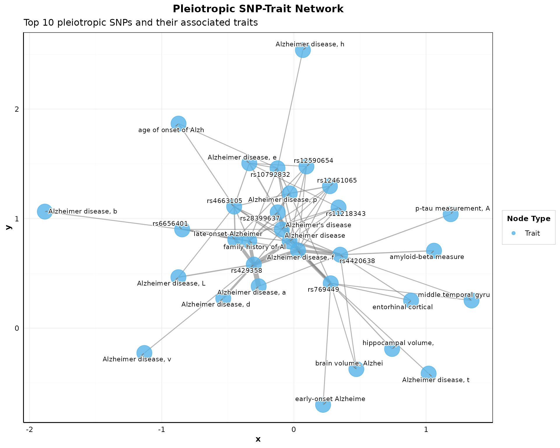
Visualize connections between pleiotropic SNPs and their associated traits:
if (nrow(pleio_results) > 0) {
  p_network <- plot_pleiotropy_network(
    pleio_results,
    top_n_snps = min(10, nrow(pleio_results)),
    node_size_snp = 6,
    node_size_trait = 10,
    layout = "fr",
    show_labels = TRUE,
    color_palette = "okabe_ito"
  ) + theme_pleiotropy_publication()

  print(p_network)
}
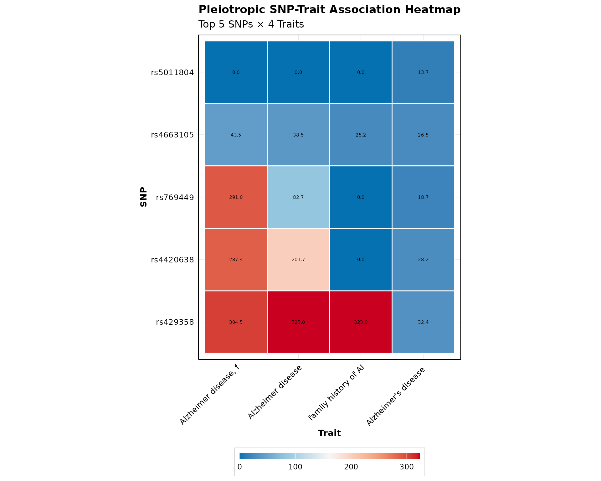
Heatmap Visualization
Create a heatmap showing SNP-trait associations:
if (nrow(pleio_results) > 0) {
  p_heatmap <- plot_pleiotropy_heatmap(
    pleio_results,
    top_n_snps = min(5, nrow(pleio_results)),
    top_n_traits = 4,
    value_col = "PVALUE_MLOG",
    show_dendrograms = FALSE,
    color_palette = "bluered",
    show_values = TRUE
  )

  print(p_heatmap)
}
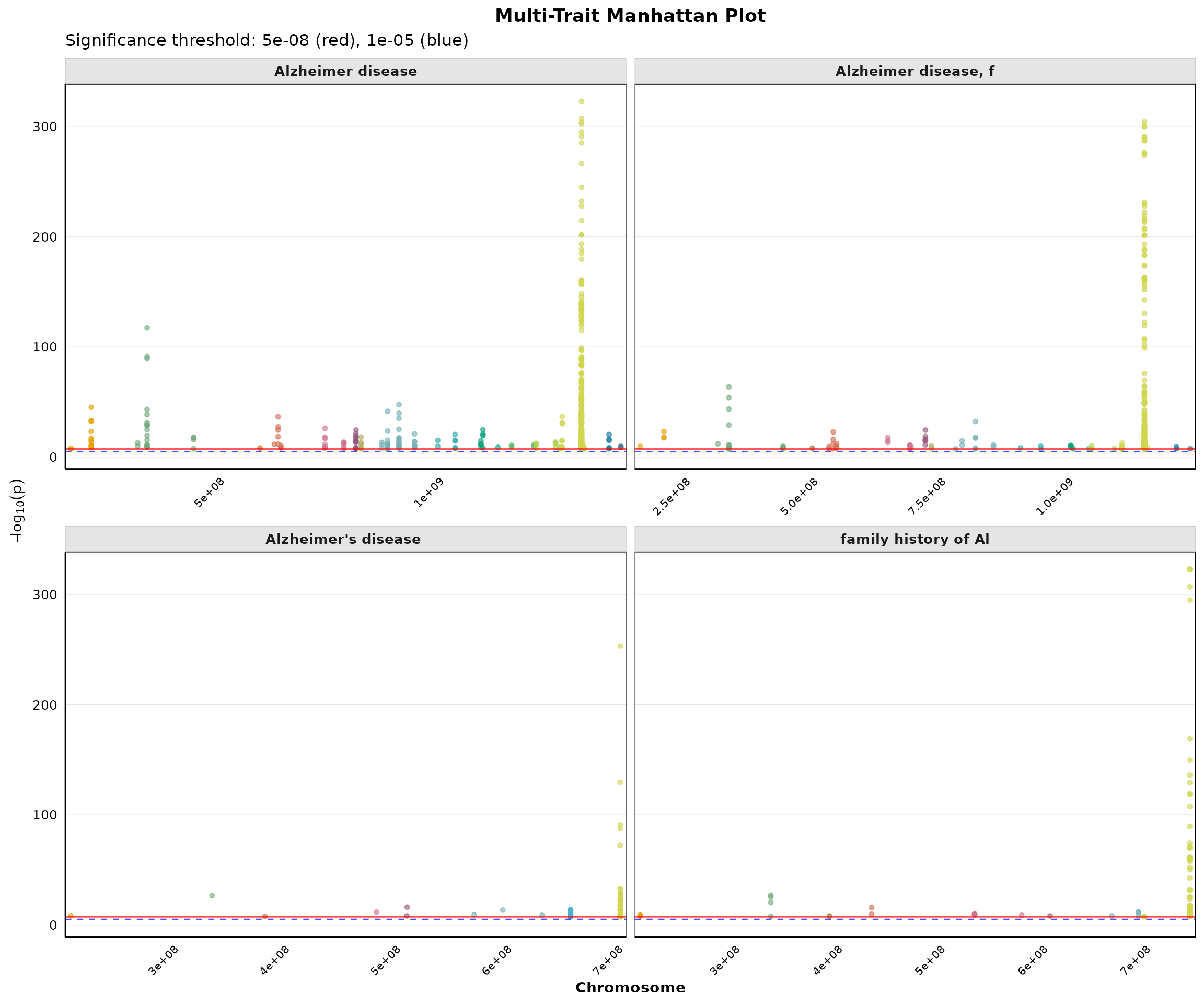
Multi-Trait Manhattan Plot
Compare genome-wide associations across multiple traits:
if (nrow(pleio_results) > 0) {
  p_multi <- plot_multi_trait_manhattan(
    pleio_results,
    max_traits = min(4, length(unique(pleio_results$MAPPED_TRAIT))),
    significance_line = 5e-8,
    suggestive_line = 1e-5,
    point_size = 1.2,
    alpha = 0.6,
    ncol = 2
  )

  print(p_multi)
}
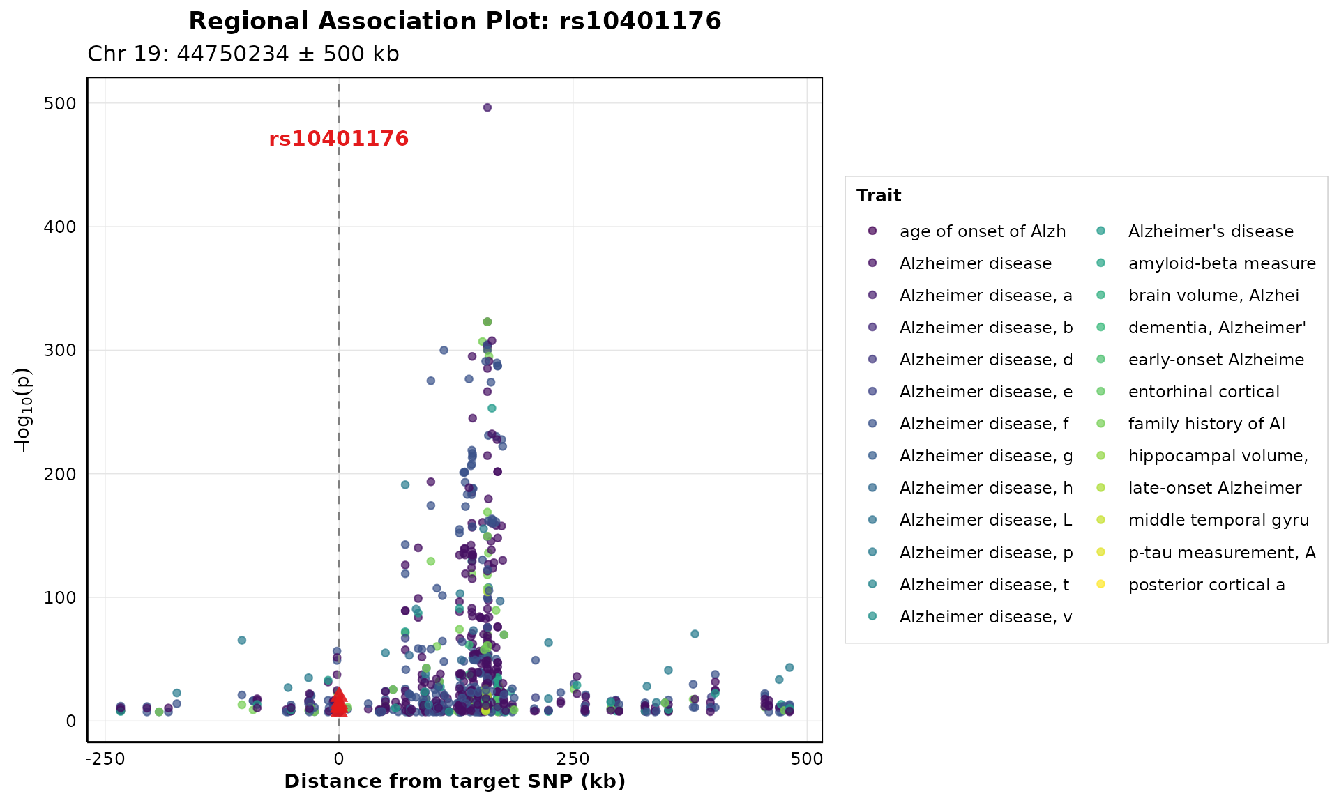
Regional Association Plot
Zoom in on specific genomic regions around pleiotropic SNPs:
if (nrow(pleio_results) > 0 && "rs10401176" %in% pleio_results$SNPS) {
  p_regional <- plot_regional_association(
    pleio_results,
    target_snp = "rs10401176",
    window_size = 500000,
    highlight_color = "#E31A1C"
  )

  print(p_regional)
}
Trait Co-occurrence Network
Visualize how traits share pleiotropic SNPs:
if (nrow(pleio_results) > 0) {
  p_cooccur <- plot_trait_cooccurrence_network(
    pleio_results,
    min_shared_snps = 1,
    top_n_traits = min(5, length(unique(pleio_results$MAPPED_TRAIT))),
    node_size = 8,
    layout = "kk",
    show_edge_labels = TRUE
    # color_by = "n_snps"
  )

  print(p_cooccur)
}
#> Warning in plot_trait_cooccurrence_network(pleio_results, min_shared_snps = 1,
#> : No trait pairs meet minimum shared SNP criteria
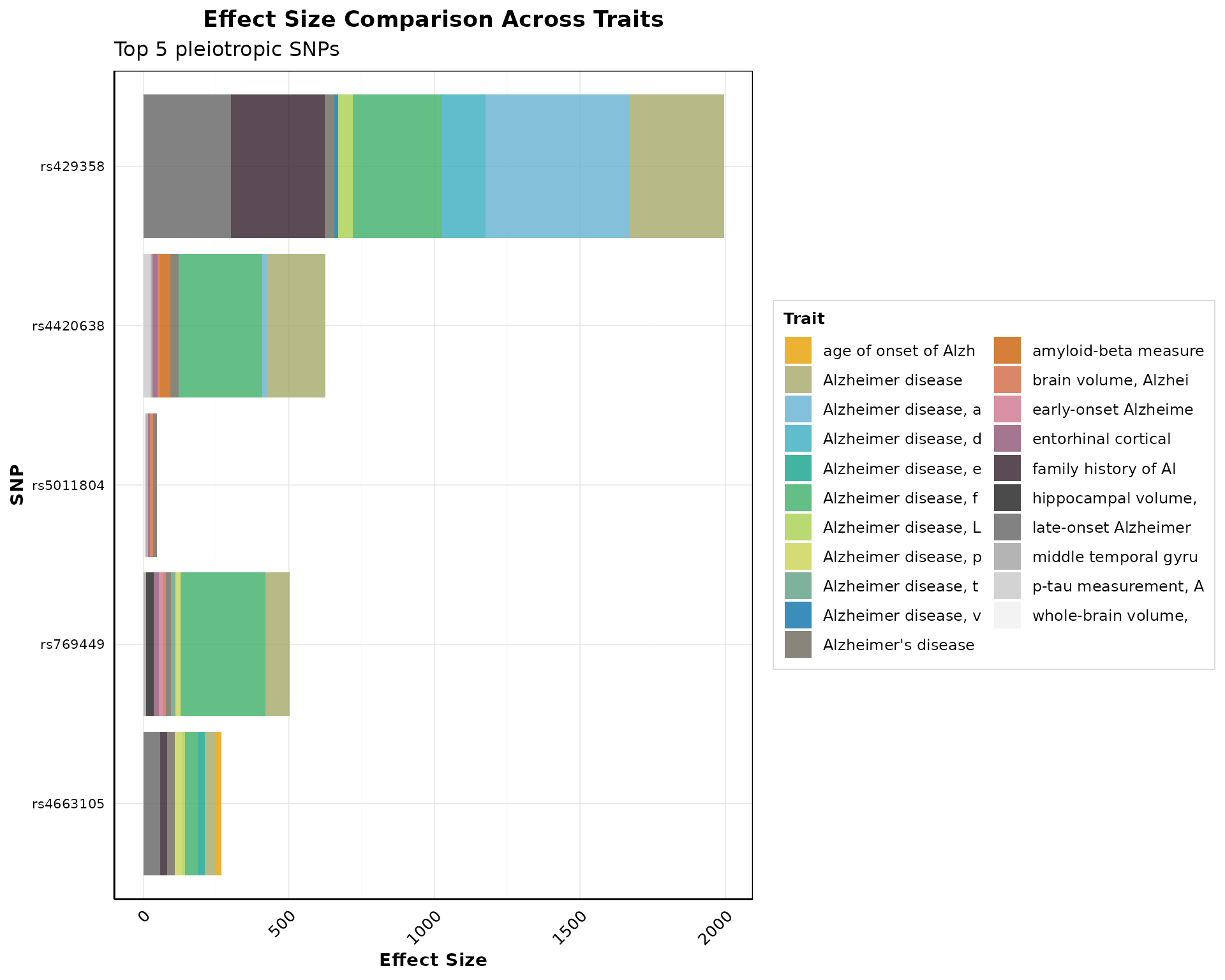
Effect Size Comparison
Compare effect sizes across traits:
if (nrow(pleio_results) > 0) {
  p_effect <- plot_effect_size_comparison(
    pleio_results,
    top_n_snps = min(5, nrow(pleio_results)),
    effect_col = "PVALUE_MLOG",
    use_log_scale = FALSE,
    color_by = "trait",
    flip_coords = TRUE
  )

  print(p_effect)
}
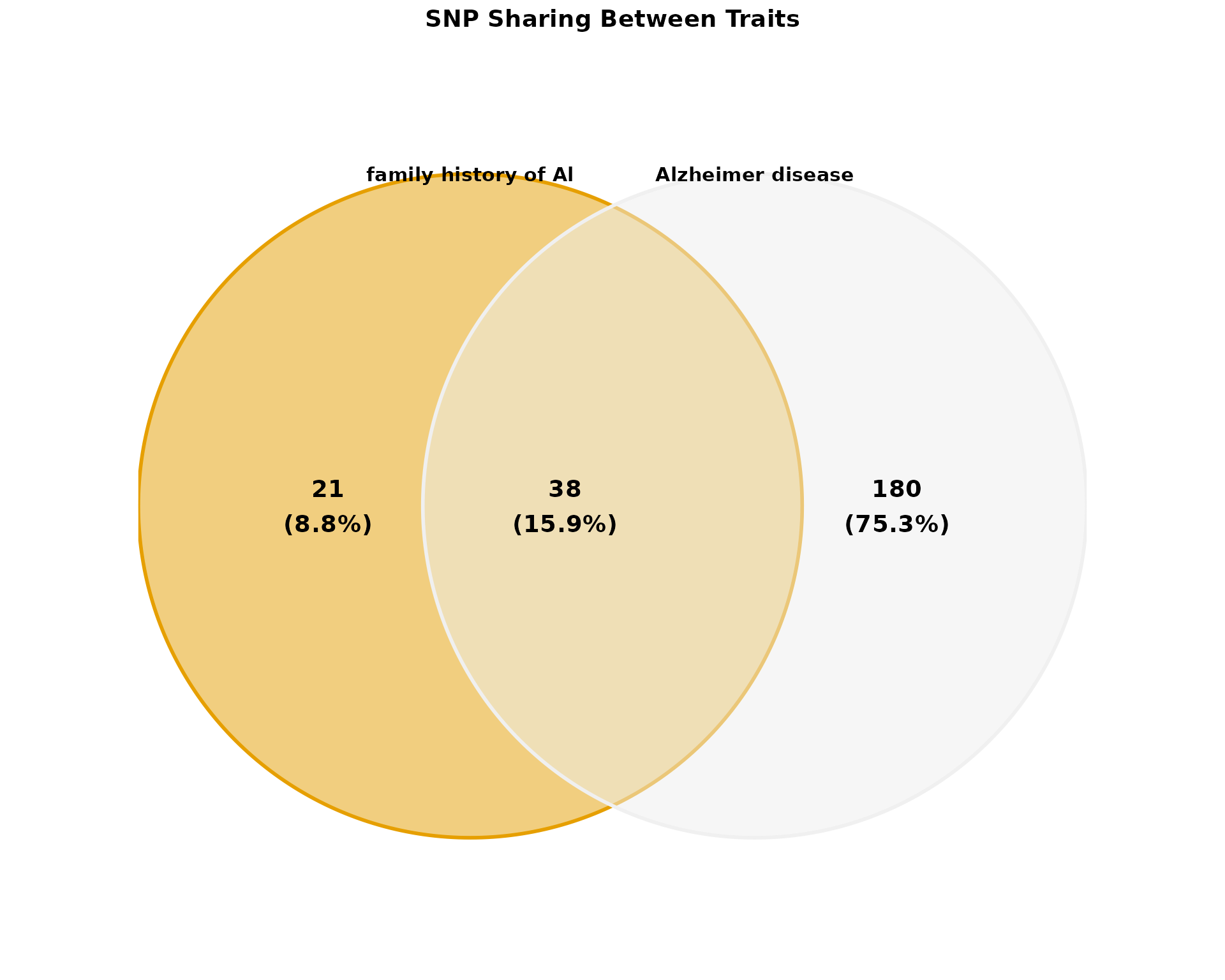
Venn Diagram
Visualize SNP sharing between traits:
if (nrow(pleio_results) > 0) {
  traits <- unique(pleio_results$MAPPED_TRAIT)[1:min(3, length(unique(pleio_results$MAPPED_TRAIT)))]

  if (length(traits) >= 2) {
    p_venn <- plot_venn_diagram(
      pleio_results,
      traits = traits[1:min(2, length(traits))],
      title = "SNP Sharing Between Traits",

      show_counts = TRUE,
      show_percentages = TRUE,
      color_palette = "okabe_ito",
      alpha = 0.5
    )

    print(p_venn)
  }
}
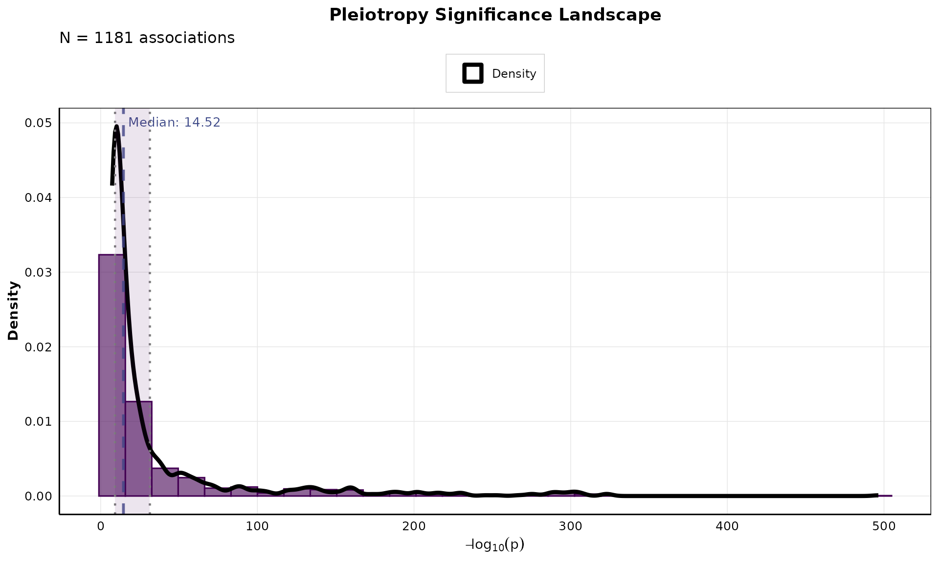
Pleiotropy Significance Landscape
Analyze the distribution of significance values:
if (nrow(pleio_results) > 0) {
  p_landscape <- plot_pleiotropy_landscape(
    pleio_results,
    n_bins = 30,
    show_median = TRUE,
    show_mean = FALSE,
    show_quantiles = TRUE,
    color_palette = "viridis"
  )

  print(p_landscape)
}
Combining Multiple Plots
Create multi-panel figures for publications:
if (nrow(pleio_results) > 0) {
  p1 <- plot_pleiotropy_manhattan(
    pleio_results,
    title = "Manhattan Plot",
  ) + theme_pleiotropy_publication()

  p2 <- plot_pleiotropy_heatmap(
    pleio_results,
    top_n_snps = min(5, nrow(pleio_results)),
    top_n_traits = 4
  )

  combined <- combine_publication_plots(
    p1, p2,
    ncol = 2,
    labels = c("A", "B")
  )

  print(combined)
}
Saving Publication-Ready Figures
Export figures in high-resolution formats:
# Save as PDF (vector format for journals)
save_publication_plot(
  p_heatmap,
  "figure1_heatmap.pdf",
  width = 8,
  height = 6
)
# Save as PNG (high-resolution raster)
save_publication_plot(
  p_network,
  "figure2_network.png",
  width = 10,
  height = 8,
  dpi = 300
)
# Save as TIFF (very high quality)
save_publication_plot(
  p_multi,
  "figure3_manhattan.tiff",
  width = 12,
  height = 10,
  dpi = 600
)
Customization Options
All visualization functions offer extensive customization:
-
Color palettes: Use
get_pleiotropy_colors()with options like “okabe_ito”, “viridis”, “plasma”, “cividis” -
Journal styles: Apply
theme_pleiotropy_publication()with “nature”, “science”, “pnas”, or “default” - Layout options: Network layouts include “fr”, “kk”, “dh”, “grid”, “circle”
- Highlighting: Emphasize specific SNPs or traits
- Labels and annotations: Add custom labels, titles, and annotations
Best Practices for Publications
- Use vector formats (PDF, SVG) when possible for journals
- Set appropriate DPI (300-600 for raster formats)
- Use colorblind-friendly palettes (e.g., “okabe_ito”)
- Maintain consistent styling across all figures
- Include clear legends and annotations
- Optimize figure dimensions for journal specifications
- Use high-contrast colors for accessibility
For more details, see the function documentation: